Actual Loss Ratios and Retained Premium Percentages
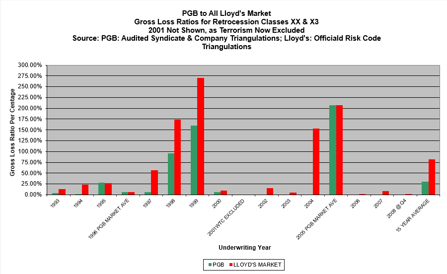
The first graph below presents a comparison between Peter’s results and the entire Lloyd’s Market’s results for Property Catastrophe Retrocession, widely considered to be one of the most difficult and volatile classes in the industry. The green columns show Peter’s audited loss ratios; the red columns represent the official results of the entire Lloyd’s Market for the same Risk Codes, XX* & X3*.
The lack of “green ink” in 2002, 2003, 2004, 2007 and 2008 indicates Peter’s 0% loss ratio for each of those years. Peter did not underwrite in 2005 and 2006, so has used the Lloyd’s Market’s average result, although achieving only that result would have been untypical for Peter. 2001 has been excluded from the both sets of results since the majority of the losses that year came from the World Trade Centre event. Terrorism is now excluded but it’s impossible to segregate the terrorism only component from the overall loss figures for 2001. It’s fairer, therefore, to exclude that year in its entirety.
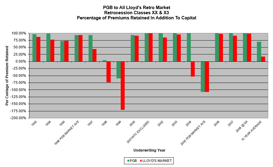
The second graph shows the proportion of net premiums retained by Peter’s account and the Lloyd’s Market as a whole, based on the audited loss ratios in the first graph. Obviously in this chart, the taller the column, the better!
*Lloyd’s Risk Codes: XX = London Market Excess of Loss; X3 = Worldwide Retrocession Excess of Loss
NB: No reliable Lloyd’s Market results are available for 1992 and prior years.
Actual:
Retained Premiums: